Tuesday, December 16, 2014

Native Advertising

Native Advertising is a type of advertising where the ad follows the natural form and function of the user environment in which it has been place, making it seem 'native' to the site and interacting with the viewer just like normal content would. 

Albeit being quite recent, native advertising has gained popularity with corporations to promote their products. Especially in an environment where consumers ignore as many ads as they can, it seems the only way to reach them (us?) now is to disguise advertisements as ads. This form of advertising is as dubious as it sounds. There are many arguments for and against it, with corporations lauding the brand awareness it creates for them, and consumers lamenting their misplaced and violated trust. 

Some of the hallmarks of native advertising are that the article would be written by an ad agency or staff of the sponsoring company, it's designed to be shared, and it's published by the website. Buzzfeed's article "11 Vintage Hairstyles Anyone Can Pull Off" epitomizes a native advertising, let's consider it more in depth to understand how native advertising really works:

The target audience of this text is women. We can glean this from the content: all the hairstyles are designed for women. Additionally, the pictured examples of these hairdos are all of women. This text has been sponsored by Makeup.com, and they are promoting their L'Oreal line of hair cosmetics. 
Their purpose of selling their products is very clear, as after each picture and hairdo there's a helpful link to "get the tools for the look here", which redirects to the L'Oreal website. L'Oreal also cleverly makes sure to not directly sell their products. For example, in Hairdo #7, it states that we should "prep hair with volumizing heat protectant." Upon following the link, it directs us to a product that gives "Lasting Volume. Heat Protection." This direct use of the same language demonstrates how L'Oreal is using a problem benefit technique to sell their products - even going to the extent of creating the problem. Any tutorials provided are also made exclusively by hair product companies and features their products prominently as part of "achieving the look". In conclusion, while it seems the article offers some helpful inspiration on how to style hair, it reveals every step of styling your hair screams "buy L'Oreal" - exposing the native advertising. 

The main ideas of this text are the hairstyles. A general theme is also that "anyone can do it". This is false, however, since only people who own these products can achieve these effects. This theme is reinforced with lines like "If you can draw an S, you can create this look", "If anyone can .... it's you" and "super simple". This complements the consumer and creates pathos, since using "you" enables them to directly identify with the idea. The general idea is that these hairstyles are effortless to create, and all it takes is that little L'Oreal bottle to get "the look". 

The tone relates closely to the theme. It's very light reading, and focuses mainly on the actual hairstyles which are shown to be effortless to ace(having tried recreating online hairstyles before, however, I know otherwise...). The mood is airy and fun, much like how normal Buzzfeed posts are like. In this respect the article blends in quite well with the general Buzzfeed content, by seeming trivial and having the structure of a list. Unlike other content on the website, however, the actual writing is minimal, and it relies mainly on links to products and tutorials. While the article doesn't actually have proper content, it has been well integrated enough (cleverly making allusions to current popular movies and TV shows) that readers will click on and maybe even share it. 

We have previously mentioned the structure of the text as a list, and how that makes it fit in with other Buzzfeed content. Structuring it as a list also makes it supremely straightforward and easy to follow, an element of logos. Including the brand publisher's name at the beginning of the story is a good move on Buzzfeed's part, Language wise, the piece employs colorful words that conjure images into our heads that we now link to these hairstyles, and function like claims as to what that hairdo can do for you. Examples include, "say bonjour to the classic french twist" or "work your medieval times fierceness". 

In all, I believe this ad functions well as native advertising by providing leisure reading that people are likely to click on. The reassuring "anyone can pull off" in the title also attracts viewers by creating a (finally unfulfilled) guarantee.  This ad represents a deceptive form of native advertising - trading genuinely funny and interesting content for something that could otherwise be titled "11 Reasons to Shop at Makeup.com". This article has no substance, which is made worse by the headline that implies an informative leisure read. 

Useful Resources: 
The Good:
The General:
The Ugly:
Brand Sponsorship Matrix:

Monday, December 15, 2014

Generation Like and The Hunger Games


How powerful is the connection between the effect of social media and the structure of the Hunger Games?
I will try to answer this question even though I believe it requires an Extended Essay to be explored thoroughly. 
 
In the documentary 'Generation Like' we saw that information on what we liked, retweeted, reblogged or shared on social media sites, i.e. our preferences, are sold to corporations who use this information to market their products. The main problem that was raised in this documentary was how social media - something we believe to be spontaneous and organic - is actually controlled with the help of statistics on our past choices. 
 
The parallels that the documentary draws between the Hunger Games and social media are these: that both require sponsors to survive; that to get sponsors one must be 'liked' (great coincidence of terminology there!) and that the Gamemakers control everything in the Arena. 
 
Given the situation the documentary has set up we could assume that the kids on social media sites are the Tributes, who will fight in the Games to the death or desperately try to get views. In the documentary itself, the way Youtubers helped each other through collaborations is mentioned, so the concept of fighting each other may not really apply in this context. We should note that Youtubers who do these "collabs", however, are quite successful. The mutual helping may not apply as much to Youtubers who are still struggling to get their name out to sponsors and to be known. And just like how contestants put on a show to win favor with sponsors in the Games, some Youtubers are forsaking their original message to create viral and racy content all for likes. 
 
Despite the fact the 'participants' may work together more often, there is still an uncanny resemblance between the Gamemakers and the corporations that market to us. In the Hunger Games, tracking devices are implanted into the arms of contestants before beginning, much like how a lot of personal information about our likes and dislikes is being sold and tracked by companies for trends. The Gamemakers can also control any part of the Arena, resembling how companies create meticulously planned marketing campaigns to sell things with games, contests etc. to get the results they want from us. 
 
The general effect of social media in this context is an environment where everyone is 'famous' in their own way and posts their identities online. This is good for corporations, and it makes these kids feel like they are controlling their own culture when in may not always be this way. Just like Katniss and Peeta's final act of resistance in the 74th Hunger Games, however, the magic of going viral and gaining like cannot always be replicated and we (the purveyors of internet culture) still have a say in what we like/dislike.


Through this all, however, we must realize that social media is a choice. It is not mandatory, so you do not have to 'sell' your identity to a corporation. Or you could just not 'like' anything and use social media purely for communication. There are other options available. 
 
While I believe the Hunger Games is a greatly exaggerated version of the effects of social media, it presents some interesting parallels to consider and explore. It's also easier to see the large picture and make connections when we have a structure (Hunger Games) that we're looking at externally to graft our situation on. 
 

Wednesday, December 10, 2014

The Problem with 'All About That Bass'

On the surface, Meghan Trainor's single 'All About That Bass' seems like a song about being body positive and loving your body, a fact that many of today's young girls no doubt need to be reminded of. Upon closer inspection however, the lyrics fall short and marginalize 'unattractive' girls by providing another standard of beauty. 

In the second verse, Trainor says she has "all the right junk in all the right places", implying that there is a right place to have the proverbial "junk". Later on, she states that "I won't be no stick figure", placing a larger body above a skinny one. She also jokingly calls skinny girls "b*tches", enforcing animosity between girls based on looks. Placing a large body over a skinny one is just as bad as doing the reverse - and is the antithesis of body positivity. 

The biggest problem with the song, however, is the fact that Trainor's happiness with her body is based on men accepting her. The song includes the refrain "My mama she told me don't worry about your size, she said boys like a little more booty to hold at night". This brings a girl's happiness back to a boy's opinion of her, and tells girls that approval from men is necessary to be accepted. This idea is reinstated in the line " 'cause I got that boom boom that all the boys chase" - again validating herself based on her desirability to men. It seems that while this song is progressive in accepting bigger girls, we cannot get past the point that a girl's worth is based on what a man thinks of her. 

As such, we see how the song marginalizes girls who do not fit Trainor's description of beauty by using derogatory names on them video. Furthermore, girls in general are depicted as requiring male approval, an over-used representation that does nothing to advance female rights and raises concern over what girls whom boys don't like are viewed as. 

Trainor's video is characterized by a mostly pastel palette, light blues, pinks, and purples are used; as well as flowers, balloons, a bedroom, cupcakes - all very feminine motifs. The video's portrayal of women is very safe, perhaps made to appeal to younger girls. 

The fact that Trainor always wears some kind of sweater or tights to 'hide' her arms and legs also proves that she's still bound by societal standards of beauty as she needs to hide the fat. The video also includes a boy that seems to be 'plastic', and Trainor dances around him while he watches in a plastic, unmoving position. He is stereotypically good looking, supporting Trainor's earlier lyrics of boys liking her. 

Despite all of this however, the video does have the virtue of not objectifying women. The four dancers that accompany her are kept the same throughout, and we see their faces, making them more than decorative objects that can be interchanged with someone else. 

While there are still many problems with this song reflecting stereotypical notions of beauty and promoting a certain 'kind' of being large, it provides a good start, and at least reflects that people are trying to (at least) seem like they care about this issue. 

Word Count: 533

Thursday, December 4, 2014

Power and Privilege: The Written Task 2


  • Chosen Question:  “Which social groups are marginalized, excluded or silenced within the text?” from the Power and Privilege section.
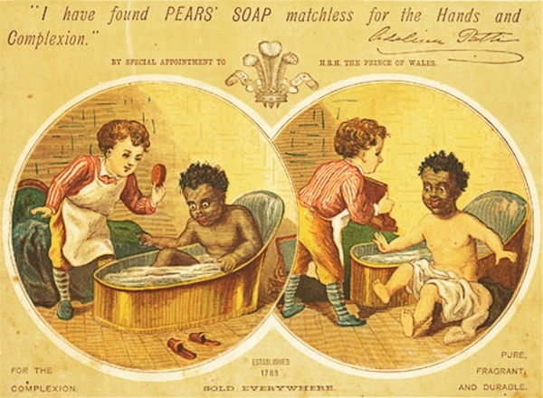
  • Text Title: An Advertisement for Pear’s Soap from the 1920s.
  • Part 2, language and mass communication.
  • In this task I’ll be focusing on:   
-        The marginalization of blacks in the Pear’s advert
-        How this is supported by the imagery and theme of the advertisement
-        How the choice to marginalize this particular social group is reflective of issues at the time
The advert:
Pears' Soap Advertisement  Caucasian Baby helps clean the "Other" baby

Written Task 2
Within this British advertisement for Pear’s soap from the 1920s, we see the black social group being marginalized. This is seen in a number of ways, but mainly through the stylistic characteristics of the two main images used in the text.
Firstly, the presentation of the black child as a caricature excludes people of dark skin by making them seem ‘abnormal’ compared to whites (as seen in the ‘normalcy’ of the white child). The black toddler has huge, bulging eyes and thick, red lips that are greatly exaggerated while also being visibly amazed at soap and water. The child is used for comedic effect, and because he differs the greatest from the white child in his skin colour, we see how he is being ridiculed based on his race. By disregarding his dignity, this advert objectifies the black child.
The exclusion of the black child is especially obvious due to the inclusion of a white child in the advert.  By depicting both races, the children become representative of their races – not just individual examples. As a result, the earlier mockery of the black child is even starker, as it is made to apply to everyone with dark skin by making them look savage and inadequate compared to people with light skin. The blacks are marginalized by comparison.
Another way this is seen is in the positioning of the children in relation to each other. The white toddler stands over the black toddler in his bathtub, taking the role of caretaker or teacher. This implies the white child having a greater intelligence to a black child. He is also nicely dressed, while the black toddler is naked and in the vulnerable position of taking a bath. This again emphasizes the power the whites had over the blacks.
Of course, Pear’s uses all this imagery of white being superior to black to their advantage by associating themselves with being white. The white child is the one holding the Pear’s soap, symbolizing that being ‘white’ is synonymous with cleanliness. The advert also mentions twice that Pear’s soap is ‘for the complexion’, reiterating that Pear’s makes you whiter and therefore cleaner. The choice of the Prince of Wales to give them Ethos is also very significant – since the idea of nobility is usually attached to being ‘pure-blooded’ and again makes Pear’s seem clean and pure.
The plot of the advert, where the white child cleans the black child and he emerges white and grateful at the end, also supports the marginalization of blacks. It seems almost as if the fair skinned people see themselves as being charitable, and are giving help to those ‘worse off’ because of their skin colour. The reaction of the black child suggests the white people wanted the blacks to feel grateful for what they had done for them.
The choice of this particular message of white superiority (that dark skinned people should accept help given to them) is especially significant during the 1920s. Around this time, Gandhi began preaching mass civil disobedience against the British rule in India, where the authorities sentenced him to six years in prison. This advert may have been a reflection of white opinion at the time – which held that dark skinned people should just be grateful for the rule they were under (like the baby in the ad), and stop trying to revolt.
In conclusion, the community of dark skinned people is marginalized in this advert by being insulted and made to be ‘lesser’ than fair skinned people. By emphasizing that being white is pure and being black/dark is the opposite, Pears excludes an entire social group, as they’re made into objects to represent dirt.


Monday, December 1, 2014

Further Oral Activity 1: Reflection

Today’s Further Oral Activity was an exploration into what advertisements reveal to us about society. I chose to investigate the topic of ‘racism’ and, more specifically, how advertising reveals to us our changing perceptions of racism (not race). I chose ads from a range of different time periods in order to reflect a changing view of racism. In my presentation, I analyzed 3 adverts – from the 1920s, 2008 and 2013 respectively.
The learning outcomes from Part 2 that I believe I have met are an awareness of the potential for political influence of the media and the way media uses language and image to persuade people. The first outcome was fulfilled as I linked the central themes of ads and their usage of racism to real world politics of the time, for example in the connection between the 2008 ad and the American Presidential Election at that time. The second outcome was fulfilled through the rest of my presentation, as I analyzed language in terms of persuasive words, pathos, ethos, logos, advertising techniques; and image through stereotyping and color theory. By applying these concepts to my ads I was able to analyze how language and image was used to persuade.
Although the initial analysis I completed for the ads was very thorough, encompassing details like the positioning of the figures and the fonts used within an advert (see script), not everything made it to the final cut of the presentation due to the time limit. For each advert, I made sure to discuss language (Criterion B) and the general theme of the advert (understanding of text, Criterion A). The choice to focus on these topics was based on the rubric, and they guided how much I discussed other factors of the advert (e.g. detail in analyzing color, figures, etc.) based on how the details related to theme and language.
Although I focused my analysis on Criteria A and B (to guide the content), the areas I feel most confident in are B and D. My strengths lie in D as I spent a lot of time practicing how to word what I wanted to say, and was very confident in using language effectively. I also mentioned the language used in all three ads, as part of Criterion B. Additionally, since my analysis of the adverts was so much more detailed than what I presented; it ensured that I always had content to say. However, I do not feel as strong in Criterion A since I had to gloss over the theme of the third ad as I was running out of time.
Time was the biggest problem I had with the FOA. In the future, I will make sure to time myself giving the full presentation and make sure it is comfortably within the time limit. By getting more practice before hand, I may also be able to structure my information better in order to fit more into the same time frame. All in all, in the future I need to focus on finding the most efficient order to say my information (to avoid unnecessary explanation) in order to squeeze as much useful analysis as I can into the presentation, relating back to Criterion C of Organization. In terms of analysis, I think I’m good at picking up subtle details of the ad, which was helpful in connecting them to the learning outcomes. I believe this was a successful start to my FOAs that clearly showed me how I can improve my skills in the future.